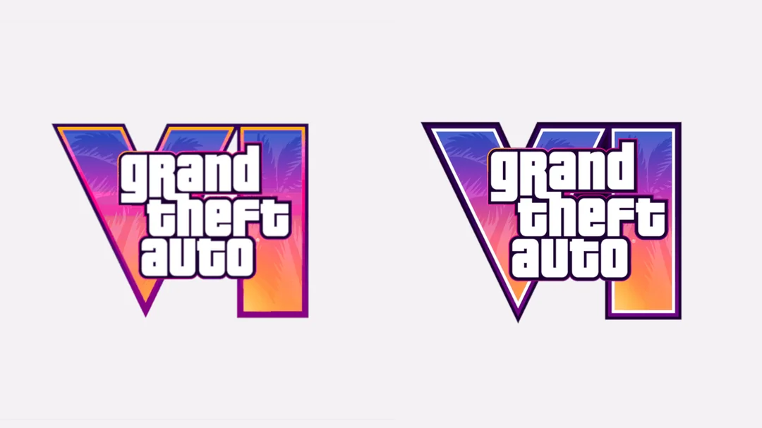
GTA 6 Logo Compared: What Changed Between 2023 and 2026?
Clickbait
new looks better i guess.

I still prefer the original. It had a cleaner, more classic GTA feel to it.

That's fair. The new one pops more, but the older version has its own charm. Both fit the game's visual identity.

Agreed. A logo has to work at different sizes, and stronger outlines can help it stand out in busy promotional artwork.